Reader request: side by side images using HTML tables
Wednesday, January 05, 2011I was helping Lilly figure out how to place two images side by side using HTML tables, when it occurred to me that a bunch of text is useless without pictures! So hopefully this tutorial (with pics) is somewhat helpful.
1) The code. Simply copy without changing anything:

text above table

<table border="0" cellspacing="0" cellpadding="0" width="100%">

<tr valign="top" align="center">

<td width="50%">1</td>

<td width="50%">2</td>

</tr>

</table>

text below table
2) Go to where you compose posts. Note that there are two tabs, "Edit HTML" and "Compose."

3) Click on the "Edit HTML" tab and paste the code in the text area:
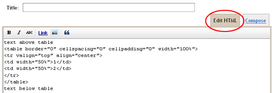
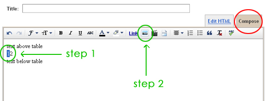
4) Click on the "Compose" tab. Highlight the text "1" and then click on the "Insert image" icon. Upload your image as you normally would. Repeat for text "2."
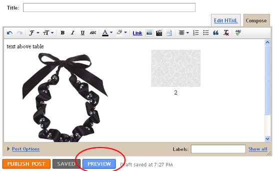
5) After you're done, you should see something like this:
6) Click on the "Preview" button (see above) to see how your images would look on your blog. *Note: there won't be a box around the images. It's there for demonstrative purposes only.
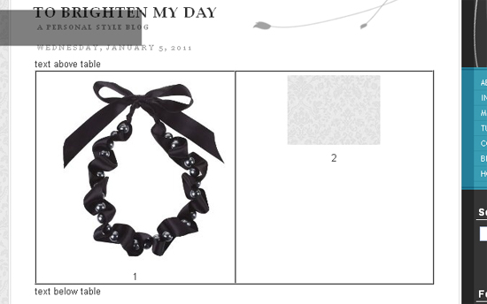
7) Go ahead and delete the text "1" and "2." I added them for temporary placeholder purposes. Replace "text above table" and "text below table" with your own text, or simply delete if they're not needed.
To add more columns or rows, continue reading. Otherwise, that's it! Now you have two images side-by-side spaced out evenly using HTML tables.
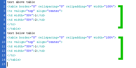
8) To add another row, simply copy and paste the original code:
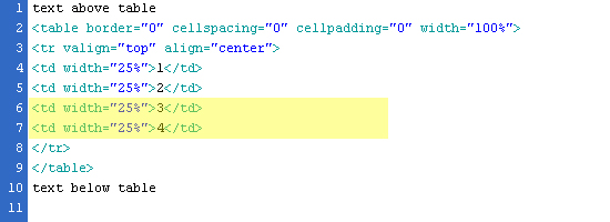
9) To add more columns, copy and paste the td line. The example below has 4 columns, so the width % has to be modified from 50% to 25% (100/4) each. If you want 3 columns, use td 3 times and change the % to 33% (100/3).
Let me know if you have any questions!
12 comments
super helpful post!! i've been messing with tables recently too but need to use the percentages for my width. thank you!!
ReplyDeletecuteandlittle.com
what a great tutorial!! thanks for sharing this!
ReplyDeleteLook at you and your awesome techie skills! I'm going to have to try this :)
ReplyDeleteLove your new layout too although I kind of miss your header photo but very elegant and clean looking!
Great tips! I usually just try to drag them until they are next to each other! LOL.
ReplyDeleteWell done girl! Thanks for sharing!
ReplyDeleteLove the new layout, it's so minimal and clean! =) Great tips with the tables, I'll have to test it out!
ReplyDeleteYou serisouly are the best! :) I'm going to try this tonigh...I'm soooo excited. Thank you so much Cee ;-D
ReplyDeleteVery helpful, thank you!
ReplyDeletelol, when your blog first came up for me, I thought there was a system problem. but this is neat, I never knew how to do that. And now I know! :)
ReplyDeleteGENIUS!!! Thank you, thank you! ;oD
ReplyDeleteLove both your old and new layout. Always looks so clean and easy to navigate. Great tutorial too.
ReplyDeleteThanks for the tutorial... I've always wondered how to easily show pics & text side by side. Will definitely bookmark this to try in the future!
ReplyDeleteI'd love to hear from you. Constructive criticisms welcome!