A Simple Home Makeover: The Front Entry
Wednesday, December 03, 2014As I predicted in my last home post, a year did indeed fly by without any new updates. My SIL recently moved out after living with us for a couple of years. With her (and all her stuff!) gone, our home suddenly looks and feels much larger. So much empty space that I couldn't wait to fill and decorate to my heart's content... much to DH's dismay, lol.
I'm a bit obsessed with mudrooms (darn you, Pinterest!) There's something about how everything is neatly organized that really appealed to me. And so first on my to-do list is our front entry.
Our foyer isn't very large and neither DH nor I are very handy, so a full-sized custom-built mudroom is a wishful dream. However, that doesn't mean we couldn't create a simple variation with key mudroom components -- hooks, storage, and seating.
After: Gone are the garbage bags! Shortly after SIL moved in, she took us to G Street Fabrics to pick out material to use for both windows (her wedding present to us.) The DIY fell through the cracks as life took precedence, so the yards of fabric were left untouched until right before her recent move. A parting and belated wedding gift rolled into one? We loved the end result. I keep going back and forth on which way to display the patterned side. Right now it's facing the street, so from our point-of-view indoors, we're seeing the "faded" back side of the fabric. I'm thinking of flipping it so we see the sunny yellow and not random strangers passing by. We'd surely enjoy it more than they would.
For the "mudroom" portion, I briefly considered an all-in-one piece (ie: one, two), but I felt that type of furniture would look bulky and take up too much room in the small space that we have to work with.
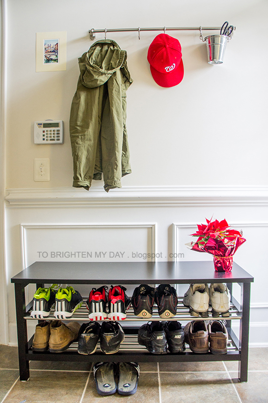
I ended up going with something more modular, because that opened up more options (item, size, style, color) and gave me the freedom to mix-and-match varying pieces together. I used the Morrows' front entry (as featured on The Curtis Casa) as inspiration for our space. I loved their clothing rack with the moveable hooks and was happy to see that I could copy the setup using the IKEA Fintorp series. Unlike the Morrows' use of a boot tray, I wanted a bench below the clothing rack so DH has a place to sit and tie his shoes instead of using the stairs. A bench was a must, but a bench that also doubled as shoe storage?! Ahh... functional and practical. I really love our finished setup. Simple, aesthetically pleasing (goes with our home's style, I think), practical, and is porportional to the space (foyer still feels pretty airy.)
As Elle keenly observed, none of the shoes on the shoe bench are mine. I own wayyy more than DH's ~10 pairs, so mine are stowed away in a nearby coat closet (photos at the bottom of this post.)
Clothing rack: IKEA Fintorp (31" rail, 5-pack hooks, flatware caddy) / Art: from random street vendor in Rome / Shoe bench: IKEA Tjusig / Jacket: Gap (similar) / Hat: MLB Washington Nationals / Shoes: DH's
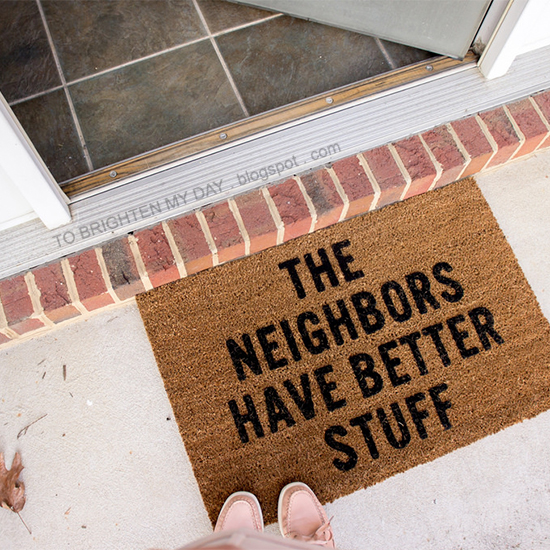
On a final note... a doormat for the front door wasn't on our radar at all. That is, until I literally laughed out loud the first time I saw this cheeky doormat. The saying is so true! And definitely applies to us.


4 comments
lol, your doormat got me laughing!
ReplyDeleteLoved the addition of the bench/shoe rack and LOL on that doormat!
ReplyDeleteI love the doormat! Too funny.
ReplyDeleteblush and simplicity
Glad y'all got a good laugh, @Olyvia, @lisacng, @Vicky
ReplyDeleteI'd love to hear from you. Constructive criticisms welcome!